

In brief (~1 min read)
I led the creative direction and brand development for Sterling Properties, creating a modern, distinctive identity designed to stand out in a competitive market.
I built a flexible brand system that works across digital, print and environmental touchpoints - from website design through to marketing and campaign assets.
The result was a clear, confident and scalable brand that strengthened perception, built trust and supported long‑term growth.
In detail
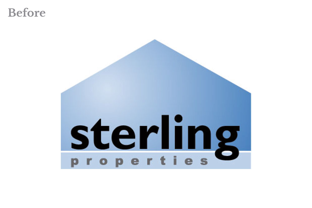
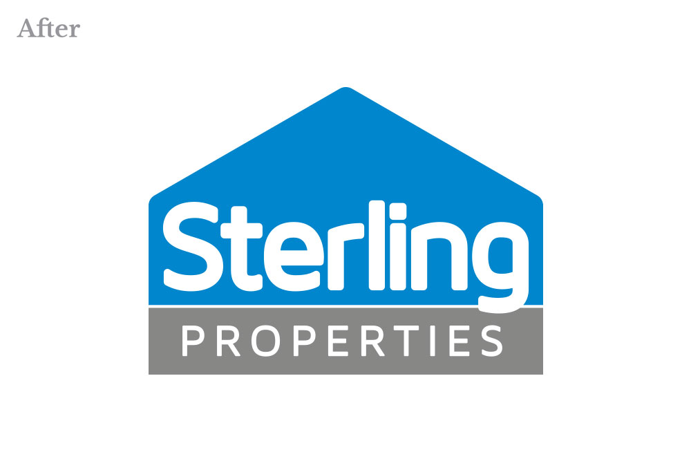
My work with Sterling Properties was about creating a brand that could genuinely stand apart in a crowded and often predictable market. I wanted to bring a stronger sense of clarity, character and modernity to how the business presents itself.
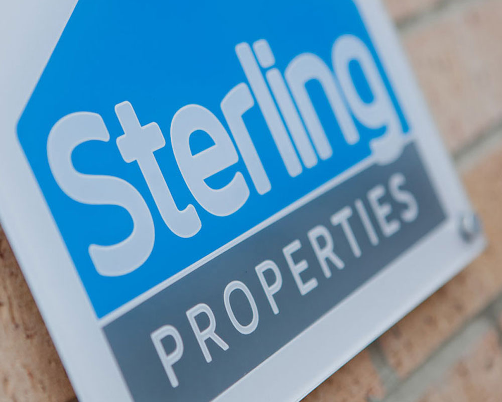
I led the creative direction, developing an identity that feels confident but approachable—and that works consistently across both digital and physical touchpoints. Rather than following typical property sector cues, I focused on building something more distinctive: clean, considered and designed to last.
From the outset, I approached it as a system, not just an identity. I defined the core elements: typography, colour, tone of voice and brand behaviours - and built them into a flexible framework that could scale with the business. Digital was a key part of this, and I designed a streamlined website experience centred around clarity, usability and strong visual storytelling.
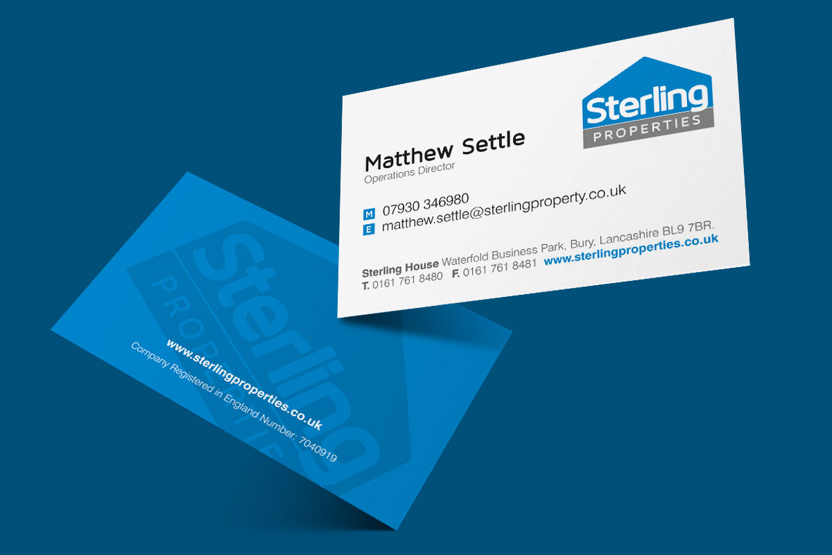
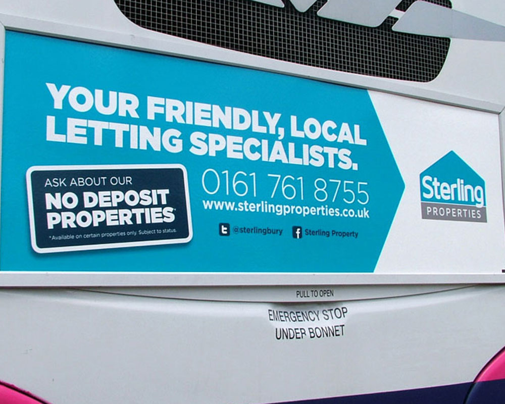
Alongside that, I developed a full suite of supporting assets, from brochures and signage to social and campaign content—ensuring everything felt consistent and joined up. The end result is a brand that not only looks sharper, but gives the business a much stronger platform to grow from.